A look at what to include and what to ditch
Don’t consider your website footer as wasted space. Visitors do in fact make it down that far. A study by Chartbeat found that users spend more time than expected scrolling down the average website. This study was quite comprehensive looking at 25 million user sessions. Many users see content that is 1200 pixels down, which is about the size of two screens, with 700 pixels being the average size.
So this means that yes, site visitors do see your footer. It needs to be optimised. Setting a strategy for how to best optimise the footer is the first step. In this blog, we’ll be looking at five critical elements your website footer should contain as well as techniques to avoid.
Include goal Calls to Action (CTAs)
Each website page has specific goals based on CTAs. These can vary from downloading a piece of content to subscribing to a newsletter to customers clicking on customer service. All these CTAs are probably in many places on your website, on the home page or on side menus or pop-ups. However, that doesn’t mean they will always be noticed. Users may scroll too quickly or just not give much attention to these CTAs. One idea is to put some of these in your footer. Just a few quick, simple CTA actions. Test to see if the goals increase; if so, was it due to the CTA links in the footer versus the other areas they live on the site?
All these CTAs should be relevant to what you’d expect a user to check the footer for, like sign-ups, stay connected socially, help or shop. These links may change based on the interaction users have. You’ll need to determine if the footer is an area where new visitors seek information or if returning customers look for the links most needed for their interaction with the site.
Footer linking: internal and external
A great website footer will provide visitor navigation of your site. This practice starts to veer toward black hat SEO when the links are there to capture rankings for certain keywords. Black Hat SEO refers to aggressive SEO strategies and tactics that focus only on search engine rankings and not on human users. These techniques are typically in opposition to search engine guidelines. Examples include link baiting, scraping and footer links focussed on keywords rather than navigation.
The user experience gets upended by using these link bait techniques in a footer. Simply, ask yourself whether the links in the footer are related to useful navigation that a visitor would need like blog, contact, about or shop. If its relevance is only related to keyword ranking then don’t include it.
Further, the links in the footer should be internal. There’s really no reason for external linking in the footer. Moz, a leader in keyword strategies, bluntly states that Google has been very clear that this practice is a violation. So, plainly stated, do not link externally in the footer.
Necessary legal elements
A footer is also a central place for legal notations. Copyright should always be included in your footer; it should also always be updated to reflect the current year. It’s the first line of defense against website plagiarism. Use code to automatically update the year to ensure it’s always up-to-date.
Including the Privacy Policy is also a standard footer link. It would then link to your Privacy Policy page, which explains what type of information the website collects.
Terms of Use is the third legal link you’ll want to add. Terms of Use is akin to a disclaimer, stating what a user agrees to by visiting the site.
Make it easy to be found or contacted
Providing the address, map and direction buttons helps users find you quickly. This information is particularly relevant if you have a physical location to which your customers can go. This gives a user the exact information they need on the first page. By hitting the address, they can instantly receive directions to the location on their smart phone. Another benefit is that having this information linked to Google maps lets Google know where you are, which can then provide additional local SEO benefits.
Along with this contact information, you’ll want to include a phone number. If you are a local company then the area code informs Google that your business is local. The phone number should be touch-to-dial on mobile so that customers can call you with one tap.
Social Media icons and feeds
Social Media icons on the footer are a bit controversial. Although these icons link to your social media accounts, it’s still sending a visitor away from your site. However, most website footers do contain these. That doesn’t mean you shouldn’t put the social media icons on other areas of your website.
Another option is to include feeds from your social media profiles, like your latest tweets or pins. This provides a bit more of an interactive experience for the user. It also acts as an attention getter for some great content or visuals.
To determine if social media icons or feeds are right for your website footer, test it. Test icons for 90 days then feed for 90 days, then look at the results. If one performed well, keep it. If neither did then ditch them.
One additional tip for creating an optimised website footer is to stay true to your brand and design aesthetic. The footer should be a natural extension of your brand. Thus, if your site is highly creative and unique, create a unique footer. If you have a simple, streamlined look then the footer should demonstrate that look.
Footer Examples
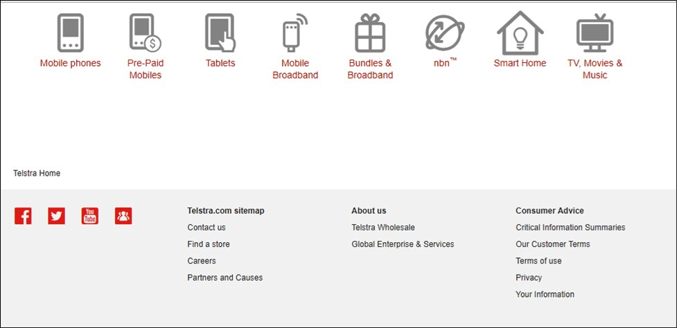
This is the Telstra footer. The icons above the footer on the home page are interesting and attractive. Whereas the footer is very standard. Telstra might see more interaction with their footer if they included the icons rather than just text.

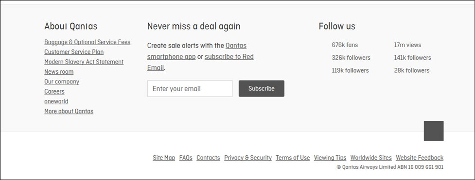
Qantas may also be missing opportunities with their footer. There’s nothing wrong with it, but there’s nothing great about it. Qantas is known for being a well-respected and sophisticated brand. However, for social media, they actually include their current follower counts, which could influence people to follow due to FOMO (fear of missing out).

The French Connection footer is clean and simple yet has an elegance to it. It has many of the best practice attributes including important navigation, a relevant CTA and social icons.

Now, it’s time for you to assess your current website footer. Does it include these best practices? Are there missed opportunities or areas for improvement?
If you’d like to get a quick assessment of your website footer and your website design, we’re here to help. Learn more about working with Digital Marketing Specialists today or you can email me directly with the link in the Author Bio.


